
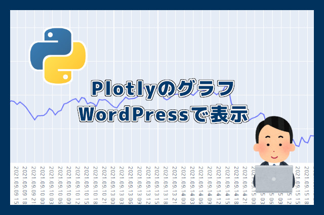
みなさん、こんにちは。
今回はPlotlyで作成したグラフをWordPressに表示する方法を紹介しようと思います。
PlotlyはHTMLコードを使用したグラフなので、Webブラウザ(chrome, firefox, edge等)で表示することが出来、各グラフの点などをマウスカーソルで近づけると、数値が表示できます。
そして、作成したグラフを、WordPressなどのブログに掲載出来れば、さらに活用幅が拡がりますよね。
当サイトも、FX為替予想をしておりまして、ドル円チャートを表示させたいと思い、その方法をシェアしようと思ったのが今回の記事の内容となります。
Plotlyのグラフ作成については、下記の記事を参考にして下さい。
WordPressに表示する手順
今回のポイントは、グラフデータをHTML出力する所です。
使用するデータ
ドル円の為替データを使用します。
今回はWordPressに表示する手順の紹介なので、データは限りなく少なくしております。
2021.09.01,110.031
2021.09.02,109.931
2021.09.03,109.726
2021.09.06,109.832
2021.09.07,110.284
テキストエディタ(メモ帳、Mery等)を開き、上記の月日と価格をコピペし、『USDJPY.csv』という名前で保存して下さい。
プログラムコードの説明
import pandas as pd
import plotly


csvfile = "C:/Labo/USDJPY.csv"

df= pd.read_csv(csvfile, header=None, usecols=[0, 1])

graph = plotly.graph_objs.Scatter(
    x=df.iloc[:, 0],
    y=df.iloc[:, 1],

    name="ドル円"
)

data = [graph]
fig = plotly.graph_objs.Figure(data=data)

with open('C:/Labo/graph.txt', 'w') as f:
     f.write(fig.to_html(include_plotlyjs='cdn',full_html=False))
1、2行目 ライブラリのインポート
import pandas as pd
import plotly
ライブラリをインポートします。
5行目 読み込みファイルの定義
csvfile = "C:/Labo/USDJPY.csv"先ほど作成したファイルの保存場所です。
7~17行目 グラフデータを作成
df= pd.read_csv(csvfile, header=None, usecols=[0, 1])

graph = plotly.graph_objs.Scatter(
    x=df.iloc[:, 0],
    y=df.iloc[:, 1],

    name="ドル円"
)

data = [graph]
fig = plotly.graph_objs.Figure(data=data)
最後の行の変数 fig にグラフのデータが格納されます。
19,20行目 グラフデータをHTML出力
with open('C:/Labo/graph.txt', 'w') as f:
     f.write(fig.to_html(include_plotlyjs='cdn',full_html=False))
グラフデータをHTML出力し、データファイルに書き込むコードになります。
fig.to_html がグラフデータをHTML出力する関数になります。
オプション内の full_html=False をすることにより、データファイルに必要なHTMLコードだけが出力されることになります。
C:/Labo/graph.txt がHTMLコードを書き込むファイルになります。
出力データをWordPressに貼り付け
先ほどの C:/Labo/graph.txt を開きます。
下記のコードが記載されています(クリックするとコードが表示されます)。
<div><script type="text/javascript">window.PlotlyConfig = {MathJaxConfig: 'local'};</script>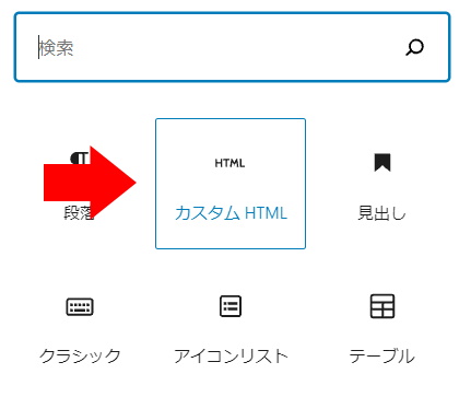
<script src="https://cdn.plot.ly/plotly-latest.min.js"></script><div id="424e2294-8527-438b-be5e-91ae609b67c1" class="plotly-graph-div" style="height:100%; width:100%;"></div><script type="text/javascript">window.PLOTLYENV=window.PLOTLYENV || {};if (document.getElementById("424e2294-8527-438b-be5e-91ae609b67c1")) {Plotly.newPlot("424e2294-8527-438b-be5e-91ae609b67c1",[{"name": "\u30c9\u30eb\u5186", "type": "scatter", "x": ["2021.09.01", "2021.09.02", "2021.09.03", "2021.09.06", "2021.09.07"], "y": [110.031, 109.931, 109.726, 109.832, 110.284]}],{"template": {"data": {"bar": [{"error_x": {"color": "#2a3f5f"}, "error_y": {"color": "#2a3f5f"}, "marker": {"line": {"color": "#E5ECF6", "width": 0.5}}, "type": "bar"}], "barpolar": [{"marker": {"line": {"color": "#E5ECF6", "width": 0.5}}, "type": "barpolar"}], "carpet": [{"aaxis": {"endlinecolor": "#2a3f5f", "gridcolor": "white", "linecolor": "white", "minorgridcolor": "white", "startlinecolor": "#2a3f5f"}, "baxis": {"endlinecolor": "#2a3f5f", "gridcolor": "white", "linecolor": "white", "minorgridcolor": "white", "startlinecolor": "#2a3f5f"}, "type": "carpet"}], "choropleth": [{"colorbar": {"outlinewidth": 0, "ticks": ""}, "type": "choropleth"}], "contour": [{"colorbar": {"outlinewidth": 0, "ticks": ""}, "colorscale": [[0.0, "#0d0887"], [0.1111111111111111, "#46039f"], [0.2222222222222222, "#7201a8"], [0.3333333333333333, "#9c179e"], [0.4444444444444444, "#bd3786"], [0.5555555555555556, "#d8576b"], [0.6666666666666666, "#ed7953"], [0.7777777777777778, "#fb9f3a"], [0.8888888888888888, "#fdca26"], [1.0, "#f0f921"]], "type": "contour"}], "contourcarpet": [{"colorbar": {"outlinewidth": 0, "ticks": ""}, "type": "contourcarpet"}], "heatmap": [{"colorbar": {"outlinewidth": 0, "ticks": ""}, "colorscale": [[0.0, "#0d0887"], [0.1111111111111111, "#46039f"], [0.2222222222222222, "#7201a8"], [0.3333333333333333, "#9c179e"], [0.4444444444444444, "#bd3786"], [0.5555555555555556, "#d8576b"], [0.6666666666666666, "#ed7953"], [0.7777777777777778, "#fb9f3a"], [0.8888888888888888, "#fdca26"], [1.0, "#f0f921"]], "type": "heatmap"}], "heatmapgl": [{"colorbar": {"outlinewidth": 0, "ticks": ""}, "colorscale": [[0.0, "#0d0887"], [0.1111111111111111, "#46039f"], [0.2222222222222222, "#7201a8"], [0.3333333333333333, "#9c179e"], [0.4444444444444444, "#bd3786"], [0.5555555555555556, "#d8576b"], [0.6666666666666666, "#ed7953"], [0.7777777777777778, "#fb9f3a"], [0.8888888888888888, "#fdca26"], [1.0, "#f0f921"]], "type": "heatmapgl"}], "histogram": [{"marker": {"colorbar": {"outlinewidth": 0, "ticks": ""}}, "type": "histogram"}], "histogram2d": [{"colorbar": {"outlinewidth": 0, "ticks": ""}, "colorscale": [[0.0, "#0d0887"], [0.1111111111111111, "#46039f"], [0.2222222222222222, "#7201a8"], [0.3333333333333333, "#9c179e"], [0.4444444444444444, "#bd3786"], [0.5555555555555556, "#d8576b"], [0.6666666666666666, "#ed7953"], [0.7777777777777778, "#fb9f3a"], [0.8888888888888888, "#fdca26"], [1.0, "#f0f921"]], "type": "histogram2d"}], "histogram2dcontour": [{"colorbar": {"outlinewidth": 0, "ticks": ""}, "colorscale": [[0.0, "#0d0887"], [0.1111111111111111, "#46039f"], [0.2222222222222222, "#7201a8"], [0.3333333333333333, "#9c179e"], [0.4444444444444444, "#bd3786"], [0.5555555555555556, "#d8576b"], [0.6666666666666666, "#ed7953"], [0.7777777777777778, "#fb9f3a"], [0.8888888888888888, "#fdca26"], [1.0, "#f0f921"]], "type": "histogram2dcontour"}], "mesh3d": [{"colorbar": {"outlinewidth": 0, "ticks": ""}, "type": "mesh3d"}], "parcoords": [{"line": {"colorbar": {"outlinewidth": 0, "ticks": ""}}, "type": "parcoords"}], "pie": [{"automargin": true, "type": "pie"}], "scatter": [{"marker": {"colorbar": {"outlinewidth": 0, "ticks": ""}}, "type": "scatter"}], "scatter3d": [{"line": {"colorbar": {"outlinewidth": 0, "ticks": ""}}, "marker": {"colorbar": {"outlinewidth": 0, "ticks": ""}}, "type": "scatter3d"}], "scattercarpet": [{"marker": {"colorbar": {"outlinewidth": 0, "ticks": ""}}, "type": "scattercarpet"}], "scattergeo": [{"marker": {"colorbar": {"outlinewidth": 0, "ticks": ""}}, "type": "scattergeo"}], "scattergl": [{"marker": {"colorbar": {"outlinewidth": 0, "ticks": ""}}, "type": "scattergl"}], "scattermapbox": [{"marker": {"colorbar": {"outlinewidth": 0, "ticks": ""}}, "type": "scattermapbox"}], "scatterpolar": [{"marker": {"colorbar": {"outlinewidth": 0, "ticks": ""}}, "type": "scatterpolar"}], "scatterpolargl": [{"marker": {"colorbar": {"outlinewidth": 0, "ticks": ""}}, "type": "scatterpolargl"}], "scatterternary": [{"marker": {"colorbar": {"outlinewidth": 0, "ticks": ""}}, "type": "scatterternary"}], "surface": [{"colorbar": {"outlinewidth": 0, "ticks": ""}, "colorscale": [[0.0, "#0d0887"], [0.1111111111111111, "#46039f"], [0.2222222222222222, "#7201a8"], [0.3333333333333333, "#9c179e"], [0.4444444444444444, "#bd3786"], [0.5555555555555556, "#d8576b"], [0.6666666666666666, "#ed7953"], [0.7777777777777778, "#fb9f3a"], [0.8888888888888888, "#fdca26"], [1.0, "#f0f921"]], "type": "surface"}], "table": [{"cells": {"fill": {"color": "#EBF0F8"}, "line": {"color": "white"}}, "header": {"fill": {"color": "#C8D4E3"}, "line": {"color": "white"}}, "type": "table"}]}, "layout": {"annotationdefaults": {"arrowcolor": "#2a3f5f", "arrowhead": 0, "arrowwidth": 1}, "autotypenumbers": "strict", "coloraxis": {"colorbar": {"outlinewidth": 0, "ticks": ""}}, "colorscale": {"diverging": [[0, "#8e0152"], [0.1, "#c51b7d"], [0.2, "#de77ae"], [0.3, "#f1b6da"], [0.4, "#fde0ef"], [0.5, "#f7f7f7"], [0.6, "#e6f5d0"], [0.7, "#b8e186"], [0.8, "#7fbc41"], [0.9, "#4d9221"], [1, "#276419"]], "sequential": [[0.0, "#0d0887"], [0.1111111111111111, "#46039f"], [0.2222222222222222, "#7201a8"], [0.3333333333333333, "#9c179e"], [0.4444444444444444, "#bd3786"], [0.5555555555555556, "#d8576b"], [0.6666666666666666, "#ed7953"], [0.7777777777777778, "#fb9f3a"], [0.8888888888888888, "#fdca26"], [1.0, "#f0f921"]], "sequentialminus": [[0.0, "#0d0887"], [0.1111111111111111, "#46039f"], [0.2222222222222222, "#7201a8"], [0.3333333333333333, "#9c179e"], [0.4444444444444444, "#bd3786"], [0.5555555555555556, "#d8576b"], [0.6666666666666666, "#ed7953"], [0.7777777777777778, "#fb9f3a"], [0.8888888888888888, "#fdca26"], [1.0, "#f0f921"]]}, "colorway": ["#636efa", "#EF553B", "#00cc96", "#ab63fa", "#FFA15A", "#19d3f3", "#FF6692", "#B6E880", "#FF97FF", "#FECB52"], "font": {"color": "#2a3f5f"}, "geo": {"bgcolor": "white", "lakecolor": "white", "landcolor": "#E5ECF6", "showlakes": true, "showland": true, "subunitcolor": "white"}, "hoverlabel": {"align": "left"}, "hovermode": "closest", "mapbox": {"style": "light"}, "paper_bgcolor": "white", "plot_bgcolor": "#E5ECF6", "polar": {"angularaxis": {"gridcolor": "white", "linecolor": "white", "ticks": ""}, "bgcolor": "#E5ECF6", "radialaxis": {"gridcolor": "white", "linecolor": "white", "ticks": ""}}, "scene": {"xaxis": {"backgroundcolor": "#E5ECF6", "gridcolor": "white", "gridwidth": 2, "linecolor": "white", "showbackground": true, "ticks": "", "zerolinecolor": "white"}, "yaxis": {"backgroundcolor": "#E5ECF6", "gridcolor": "white", "gridwidth": 2, "linecolor": "white", "showbackground": true, "ticks": "", "zerolinecolor": "white"}, "zaxis": {"backgroundcolor": "#E5ECF6", "gridcolor": "white", "gridwidth": 2, "linecolor": "white", "showbackground": true, "ticks": "", "zerolinecolor": "white"}}, "shapedefaults": {"line": {"color": "#2a3f5f"}}, "ternary": {"aaxis": {"gridcolor": "white", "linecolor": "white", "ticks": ""}, "baxis": {"gridcolor": "white", "linecolor": "white", "ticks": ""}, "bgcolor": "#E5ECF6", "caxis": {"gridcolor": "white", "linecolor": "white", "ticks": ""}}, "title": {"x": 0.05}, "xaxis": {"automargin": true, "gridcolor": "white", "linecolor": "white", "ticks": "", "title": {"standoff": 15}, "zerolinecolor": "white", "zerolinewidth": 2}, "yaxis": {"automargin": true, "gridcolor": "white", "linecolor": "white", "ticks": "", "title": {"standoff": 15}, "zerolinecolor": "white", "zerolinewidth": 2}}}},{"responsive": true})};</script></div>このコード全てをWordPressのカスタムHTMLのブロックに貼り付けます。
そして、プレビュー画面で確認すると、下記のグラフが表示されます。
まとめ
いかがだったでしょうか。
ブログで統計データなどを扱っている方がいらっしゃれば、スクショによるグラフの画像表示ではなく、グラフ上の数値も確認出来るPlotlの方が、閲覧者に分りやすくていいと思います。
是非、試してみて下さいね。
「役に立った!」と思れましたら、下のSNSボタンで記事のシェアをしていただけると嬉しいです!

コメント